The claim that the U.S. stock market has essentially collapsed when measured in gold instead of dollars continues to stir debate across financial and crypto communities.
As of late January 2026 (January 29–30), gold’s extraordinary volatility—surging to all-time highs near $5,600/oz before suffering sharp flash crashes and pullbacks—has created a striking contrast with the S&P 500, which remains near record levels in nominal dollar terms.
Latest Data Snapshot (January 29–30, 2026) S&P 500
Closed: ~6,969.01 on January 29
Daily move: −0.13%
Recent range: 6,950–7,000
Context: Still near all-time highs in dollar terms, supported by resilient corporate earnings, AI-driven growth, and sector momentum despite periodic pullbacks.
Gold Price
Peak: ~$5,594–$5,600/oz earlier in the week
Pullback: Sharp 5–7% intraday drops
January 30 levels: ~$5,009–$5,130/oz
Drivers of volatility: Profit-taking, dollar rebounds, leveraged positioning resets
Performance:
Up ~15–25% in January alone
Longer-term gains exceed 80% in some trailing periods
Despite corrections, gold remains firmly in a powerful long-term uptrend.
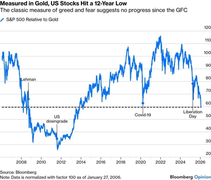
S&P 500 to Gold Ratio
Metric:
S&P 500 Index ÷ Gold Price per Ounce
Current range: ~1.32–1.37 ounces
Reported levels:
~1.32 (Jan 25 – LongtermTrends)
~1.36 (Jan 26)
~1.37 (Jan 27–28)
Other estimates: ~1.29–1.45 in late January
These readings place the ratio at multi-year lows, reflecting gold’s overwhelming outperformance relative to equities.
S&P 500 to Gold Ratio Chart
(Historical chart from MacroTrends)
The chart shows a sharp compression toward 1.3–1.4, signaling significant relative weakness of stocks versus gold.
What the Ratio Is Telling Us
When measured in gold:
The S&P 500 appears flat, stagnant, or in relative decline
Gold’s gains have far outpaced nominal equity advances
Dollar-denominated equity “wealth” looks partly illusory
Much of the apparent stock strength may reflect fiat currency debasement, not pure productivity or real value creation
From this perspective, the provocative idea of a “collapse” gains traction—not in nominal terms, but in purchasing-power terms.
Key Drivers of the Divergence
- Gold’s Safe-Haven Surge (and Volatility)
Driven by:
Geopolitical tensions
Trade and tariff uncertainty
Dollar weakness
Central-bank diversification
Inflation and currency debasement fears
Flash crashes (e.g., ~$5,600 → sub-$5,100 within hours) highlight leveraged positioning—but do not negate the long-term trend favoring hard assets.
- Nominal Stock Resilience
Stocks benefit from:
AI and tech momentum
Earnings beats
But face:
Valuation concerns
Sector rotation
Risk-off capital flows
Reduced real returns when measured against hard assets
- Historical Echoes
Similar low ratios (below ~1.45–1.5) appeared during:
1970s inflationary periods
Post-2008 instability
Some estimates suggest a 46–48% decline in the ratio since 2022 peaks, signaling a shift toward gold-dominated cycles.
Not a Classic Crash—But a Real One
This is not a traditional stock market crash:
No widespread panic
No systemic collapse
Instead, it’s a relative collapse in purchasing power, revealing how gold has better preserved value amid growing distrust in fiat currencies.
Why This Matters for Crypto, Blockchain, and Beyond
This narrative strongly resonates in crypto circles:
Bitcoin reinforces its role as “digital gold”
Hard assets gain appeal during fiat uncertainty
Gold’s flash crashes mirror crypto’s volatility—both offer protection, but demand discipline and risk management
Portfolio implication: A balanced mix—equities for growth, gold and crypto for protection—may be better suited for navigating these cycles.
🧾 Conclusion
Viewed through the gold lens, U.S. stocks reveal a far more cautious reality. Nominal highs obscure meaningful erosion against “sound money.”
Whether this signals:
A broader volatility wave
A systemic reckoning
Or simply a temporary asset rotation
…remains open for debate.
But in January 2026, measuring markets in gold paints a sobering picture—one sharply at odds with dollar-denominated headlines.
💬 What Do You Think?
Does the S&P/gold ratio expose uncomfortable truths about fiat-driven markets? Or is gold’s recent pullback merely a reset before stocks reclaim leadership?
Share your thoughts in the comments.
Important DisclaimerLegal
All content on Bitiblocky is for educational and informational purposes only and does not constitute financial advice. Always do your own research (DYOR) and consult with a qualified financial advisor before making investment decisions. Cryptocurrency investments carry significant risk, and you should never invest more than you can afford to lose.
Frequently Asked Questions
In nominal US dollars, the S&P 500 remains near all-time highs (around 6,950–7,000 in late January 2026) due to strong corporate earnings, tech/AI momentum, and overall economic resilience. However, when priced in gold—considered a "sound money" hedge against currency debasement—the S&P 500 to Gold ratio has fallen to multi-year lows (~1.32–1.37 ounces). This means it takes far fewer ounces of gold to "buy" the equivalent of the S&P 500 index than in previous years. Gold's massive rally (peaking near $5,600/oz before pullbacks) has outpaced nominal stock gains, making dollar-based equity growth appear partly illusory when adjusted for potential fiat currency erosion.
Sign in to comment
Join the conversation by signing in